Design Brief: Redesign desktop checkout screen for an airline company
Role: Lead Designer
Deliverables: Updated checkout webpage
Software: Adobe Creative Suite (Photoshop)
_____________________________________________________________________________________
This was a redesign concept for an updated checkout screen for American Airlines. The goal was to create a functional, user friendly design that would make the checkout experience faster and easier to complete, while also being visually appealing enough to stand out against its competitors.
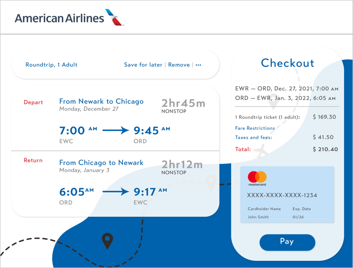
Desktop view
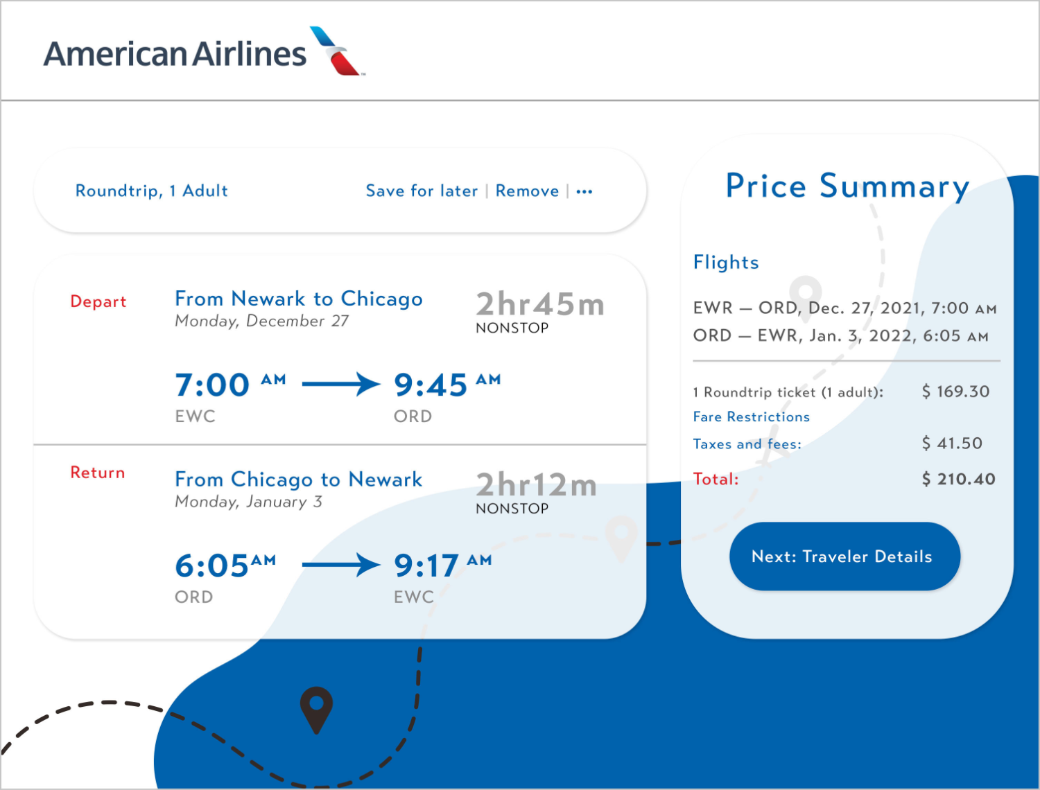
I wanted to emphasize key elements that were important to the checkout process, like the checkout process buttons, making them more rounded and using a brighter blue to visually direct customers to complete the next step. I also created visual hierarchy within the text by increasing the font sizes and using different colors for contrast within the information. To further update the design and make it feel more “modern”, I used transparent cards as backgrounds for each section, clearly arranging the information so that users could understand the costs and travel details easier and make informed decisions without hidden costs or misleading details.

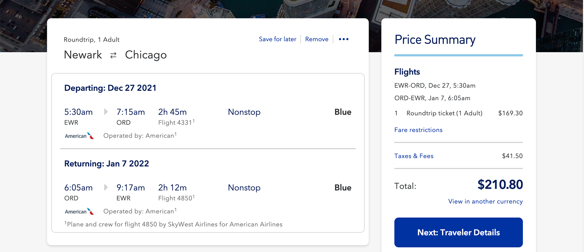
Before changes

After changes
