The product:
City Roast Café is a regional café located in New York City. City Roast’s goal is to provide top quality coffee and food, as well as quality customer service. Their demographic is similar to more popular specialty restaurant chains in the area, so staying current in technology is important for them to be able to keep up with their competition.
The problem:
Various factors, such as in-store crowding, inaccurate orders, limited seating, and long waiting times, has reduced the overall customer experience, resulting in bad reviews.
The goal:
Design an app for City Roast Café that allows customers to order ahead while on the go and reserve seating in-store.
Understanding the User
I conducted interviews and created empathy maps to understand the users I’m designing for and their needs. A primary user group identified through research was working adults who usually stop by the store on their way to work.
This user group confirmed that time was one of the biggest problems affecting City Roast Café’s customers, but further research revealed that other problems were mostly the result of in-store crowding. This feedback showed me that an app with features like ordering ahead and seat reservation would be beneficial to their customers.
Persona & Problem Statement
In order to understand the user‘s experience, I created a persona based on the user research.
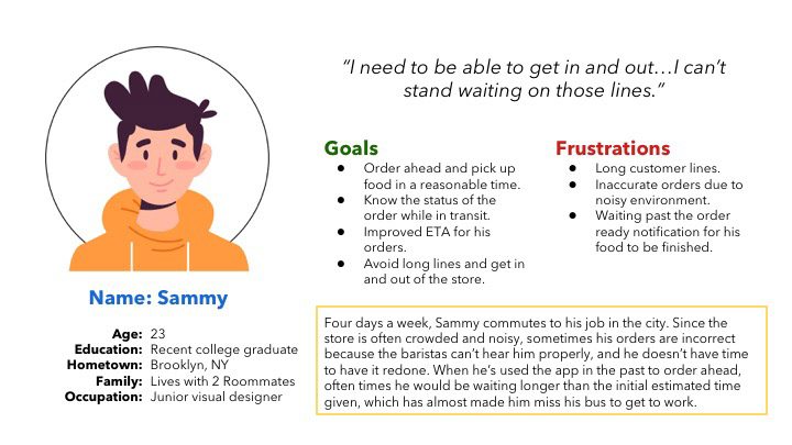
Persona 1: Sammy
Problem statement: Sammy is a young busy commuter who needs to be able to quickly place orders on-the-go because he has limited time to wait around for his order before work.
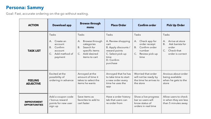
User journey map
User Pain Points
These were the top three pain points identified within the primary user group.
1. Time
People on their way to work or other engagements have limited time to wait around for orders.
2. Accuracy
Customers struggle to place accurate orders in store due to the crowded environment.
3. Availability
Customers often find limited seating in store due to its popularity and smaller size.
Starting the Design
Moving from paper to digital wireframes made it easy to understand how the redesign could help address user pain points and improve the user experience.
Paper Wireframes
Taking the time to draft iterations of each screen of the app on paper ensured that the elements that made it to digital wireframes would be well-suited to address user pain points. My focus was to create easy and quick-to-navigate screen layouts where users could place orders in a short amount of time.
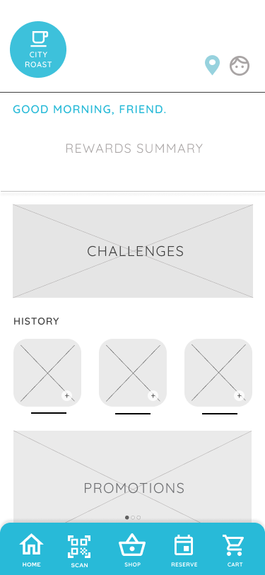
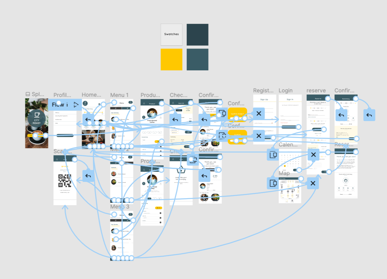
Digital Wireframes
During the initial design phase, I focused the designs on feedback and from the user research. Easy and quick app navigation was a key user need to address in the designs, in addition to equipping the app to work with assistive technologies like screen readers.
Low-fidelity Prototype
After completing a set of digital wireframes, I linked them to create a low-fidelity prototype. The primary user flow I connected was the process of ordering and confirming a purchase, so the prototype could be used in a usability study.
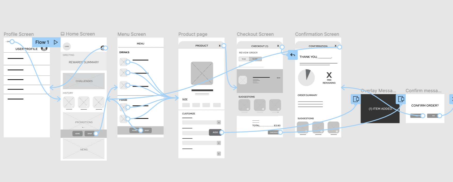
Low fidelity prototype created with Figma.
Usabilty Test
I tested the lo-fi prototype in an unmoderated usability study with 8 participants. Here are the main findings:
Result 1:
Users were unsure about navigating the app.
Result 2:
Users found completing the user flow to be too confusing.
Result 3:
Users wanted more color in the app.
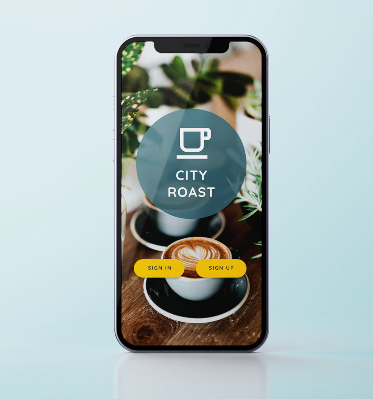
Mockup Changes
One of the biggest priorities when updating the design was to improve the navigation bar, so I added more menu options, combining icons and text for users to be able to navigate easily. I also added a cyan color to emphasize the header, so users would know what screen they’re on, and the navigation bar, so users could locate it easier.

Before usability study
After usability study
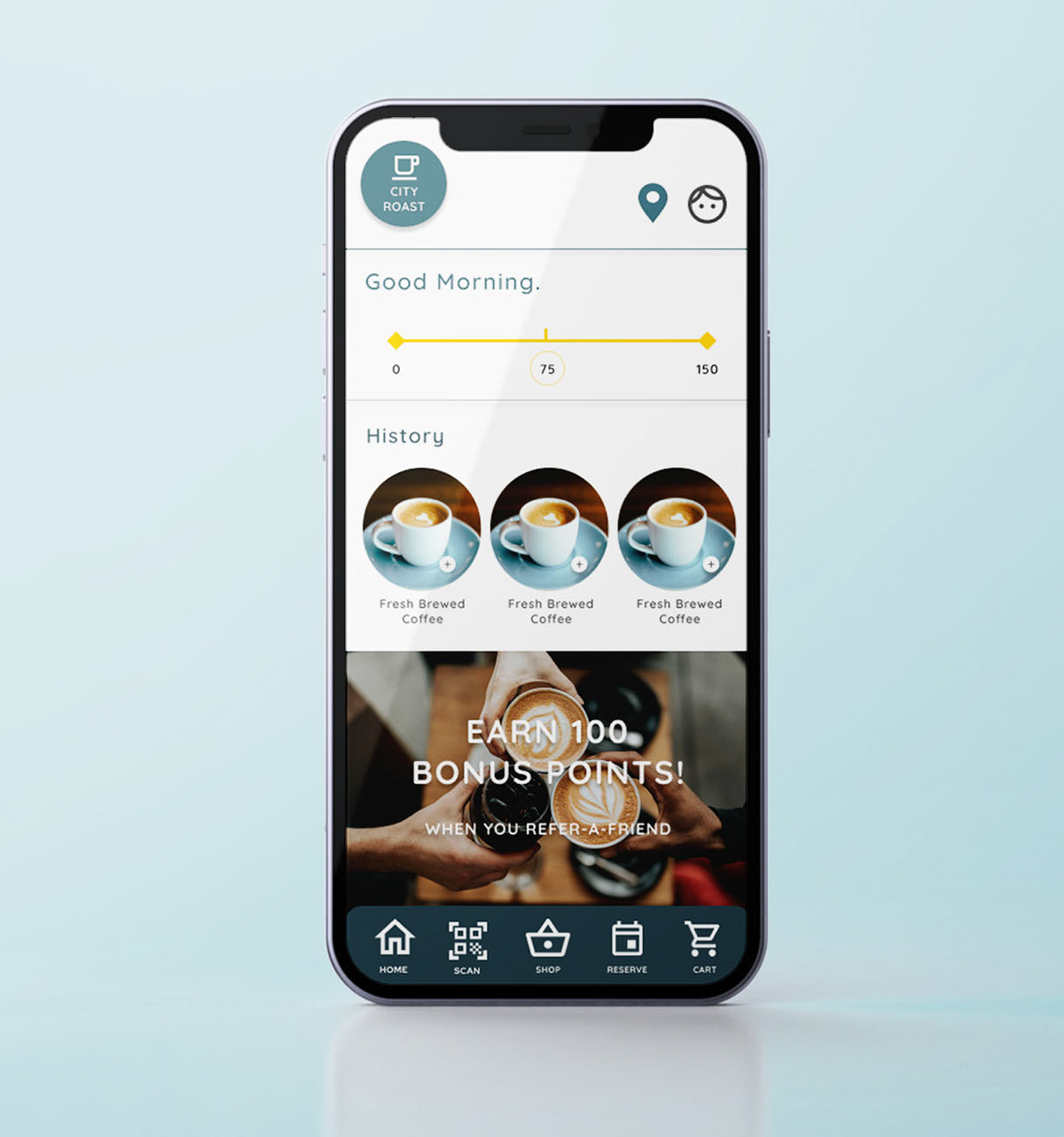
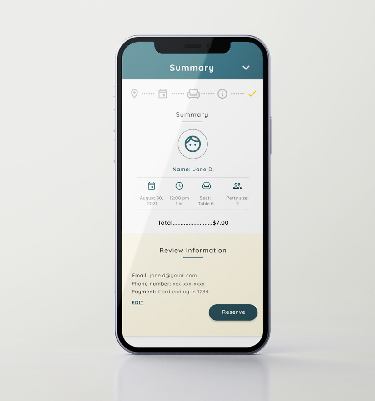
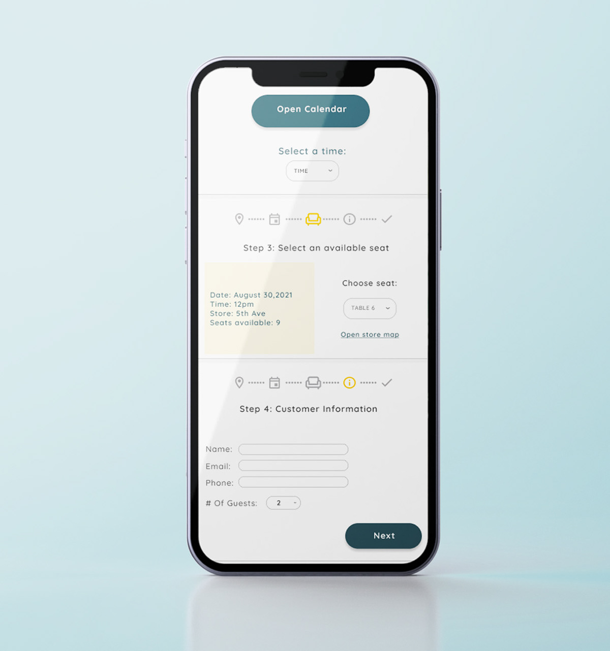
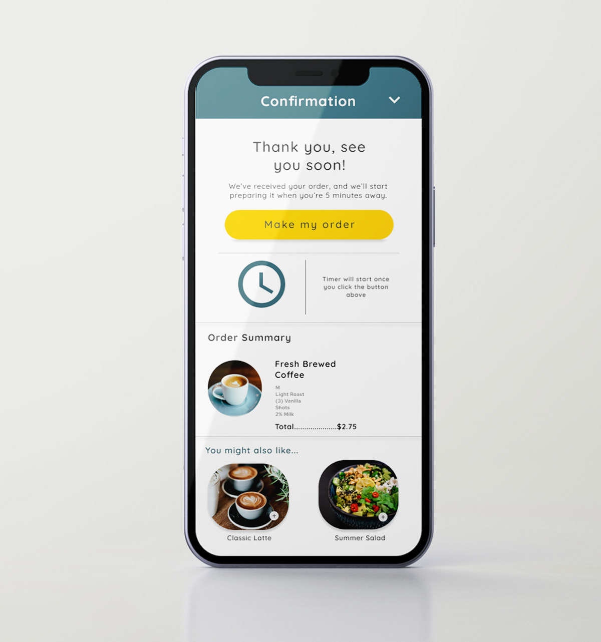
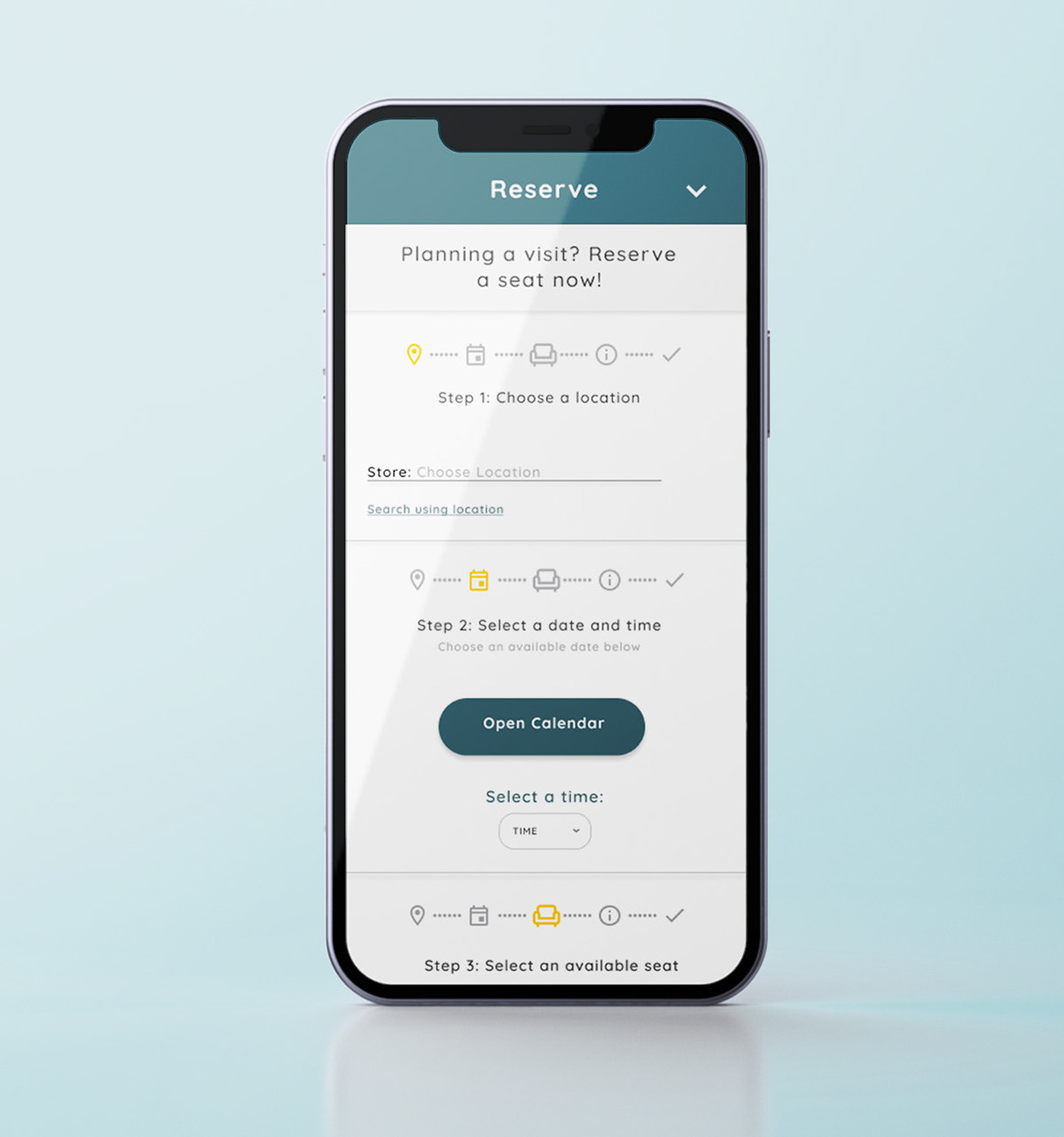
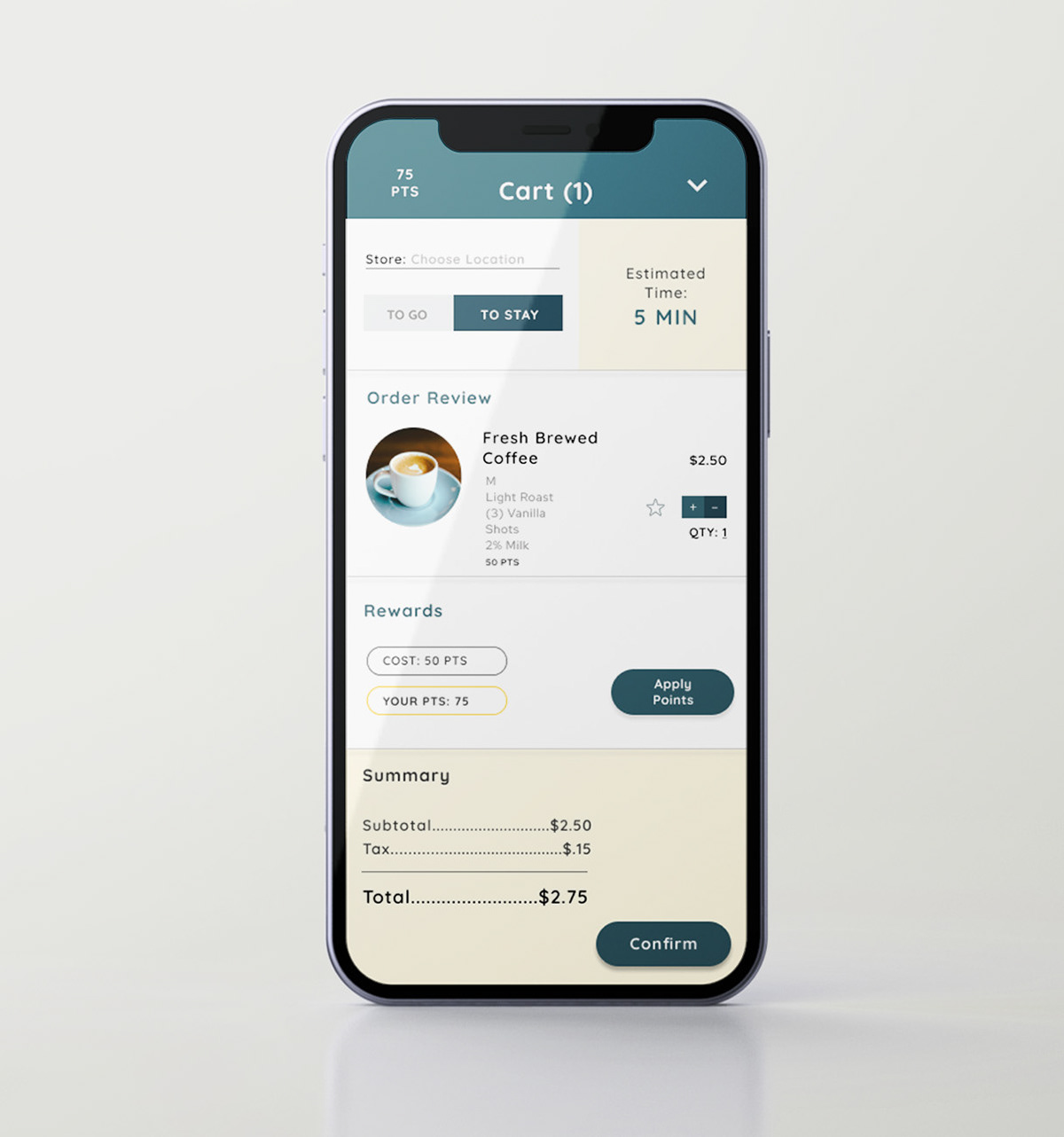
High Fidelity Prototype
The final high-fidelity prototype presented a more polished design that included clearer user flows for item ordering, as well as additional features such as a reservation menu and a QR code scan.
High fidelity prototype created with Figma.
Key Mockups
Accessibility Considerations
1. Using Adobe Color, a color scheme was created that is accessible based on WCAG guidelines.
2. Use of recognizable icons and photography to help users with vision impairments navigate the app easier.
3. Clear labels for interactive elements that can be read by screen readers.
Takeaways & Next Steps
Impact:
The app makes customers feel like City Roast Café is working hard to improve many problems they are having. Participants in the usability studies gave positive feedback regarding the app features, and 4 out of 5 participants said that they could see themselves using the app in the future.
What I learned:
While designing the City Roast Café app, I learned that the first ideas for the app are only the beginning of the process. The usability studies made me aware of certain design choices that did not work or needed further research and iteration.
Next Steps:
1. Conduct surveys to further collect feedback on how to improve the app and to measure user retention.
2. Continue to market app and encourage customer use with promotions and special in-app only offers.