Design Brief: Create a brand identity and assets for a iced coffee company
Role: Lead Designer
Deliverables: Logo design, packaging design, brand materials
Software: Adobe Creative Suite (Illustrator & Photoshop)
_____________________________________________________________________________________
Luke's Iced Coffee is a new iced coffee brand seeking a brand identity that would allow them to distinguish itself from its competitors.
For the color palette, I utilized shades of light blues to represent the "iced" aspect of the product, while the neutral browns represent the coffee. For a bright, fun, contrast that would appeal to the brand's millennial audience, I chose chartreuse, a vibrant and trending color that would be able stand out on store shelves and online. For the main logo, I paired a bold vintage display font with a bold sans-serif to create a logo capable of being eye-catching and instantly recognizable.
Primary logo
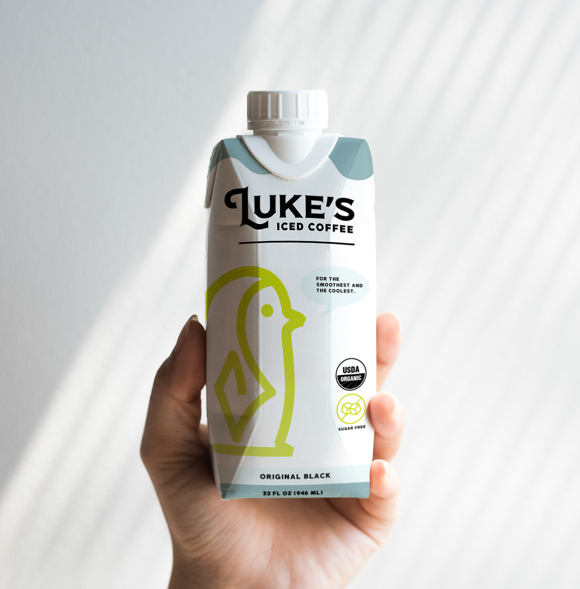
Single to go packaging
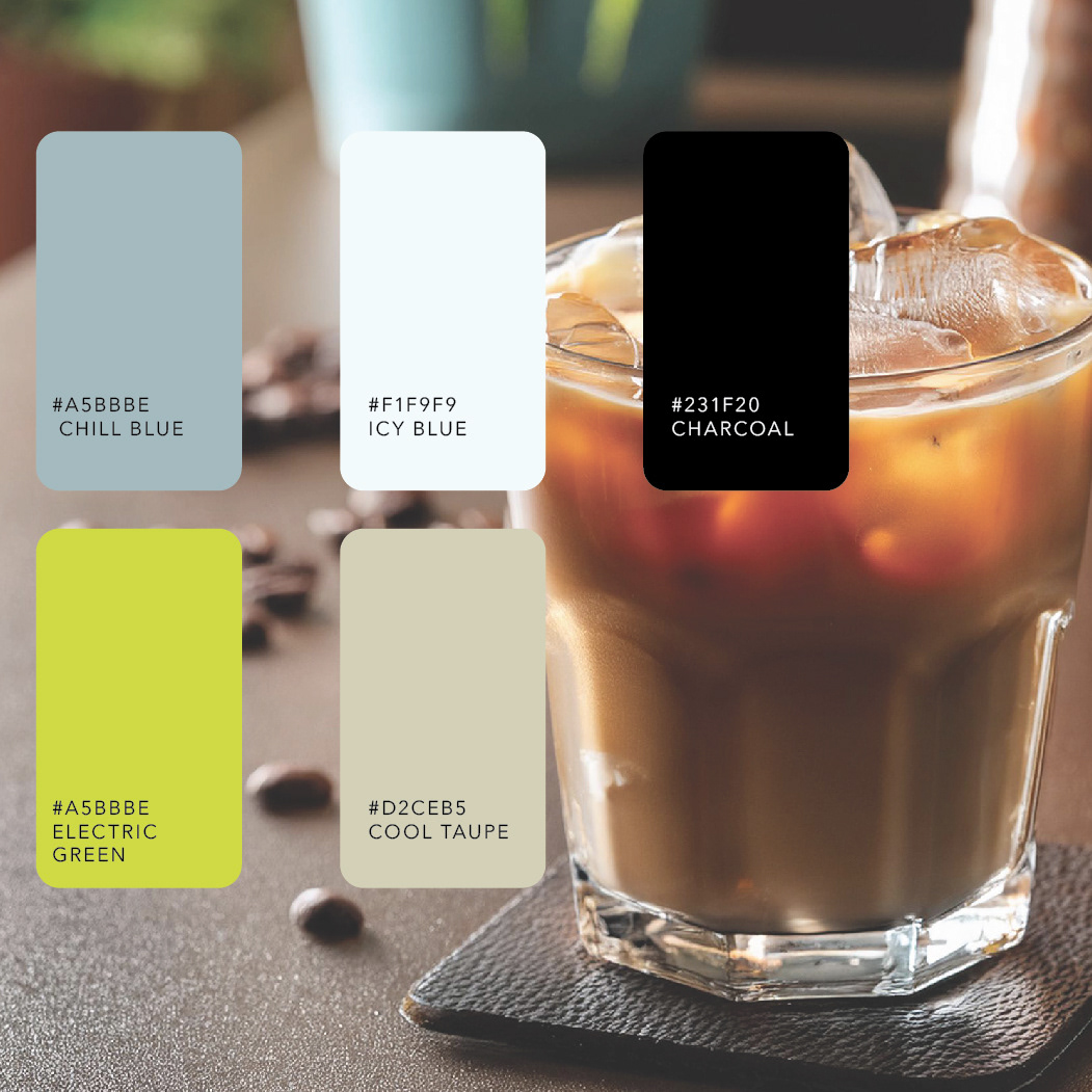
Color palette
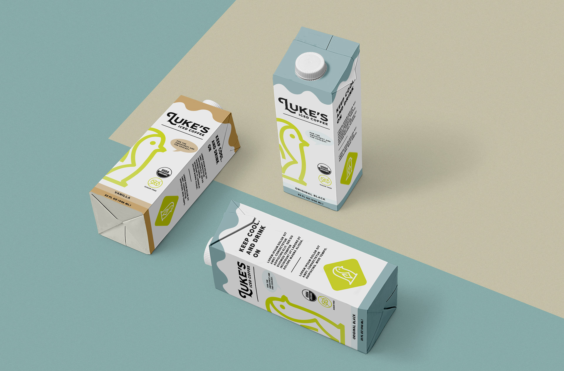
Carton mockups
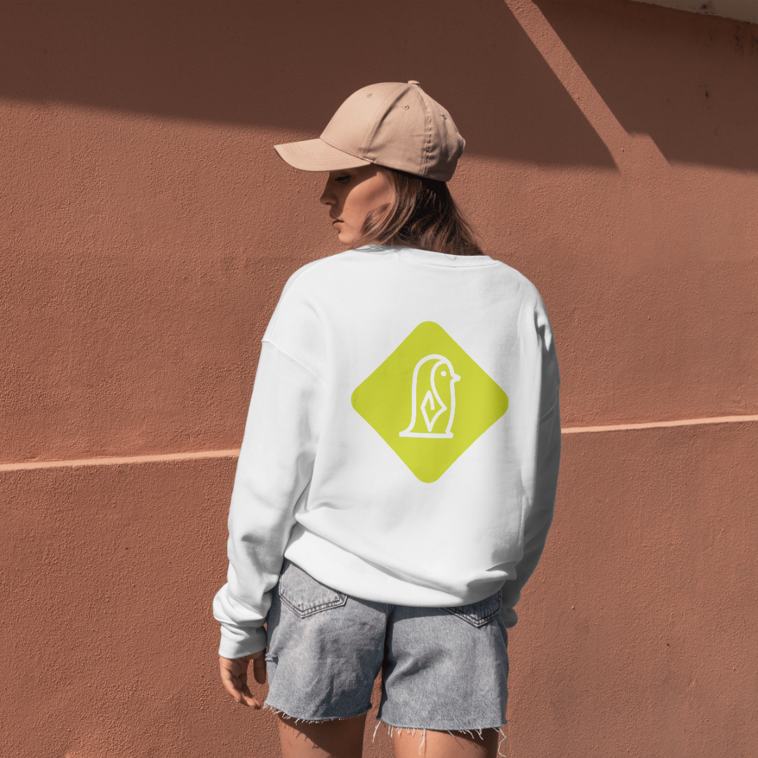
T-shirt design
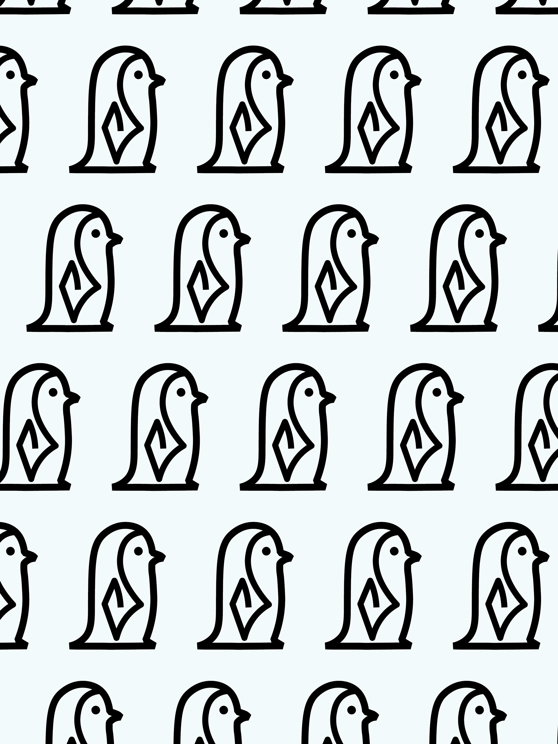
Next, I created a brand mascot that would be easy to recognize without the actual brand name attached to it. Since this is an iced coffee brand, my inspiration came from penguins, which are associated with being cute, playful, and representative of cold weather. I also wanted to create a character that could have its own story and marketing built around it, in order to get the target audience more invested in the brand. Therefore, Archie the Penguin was born.
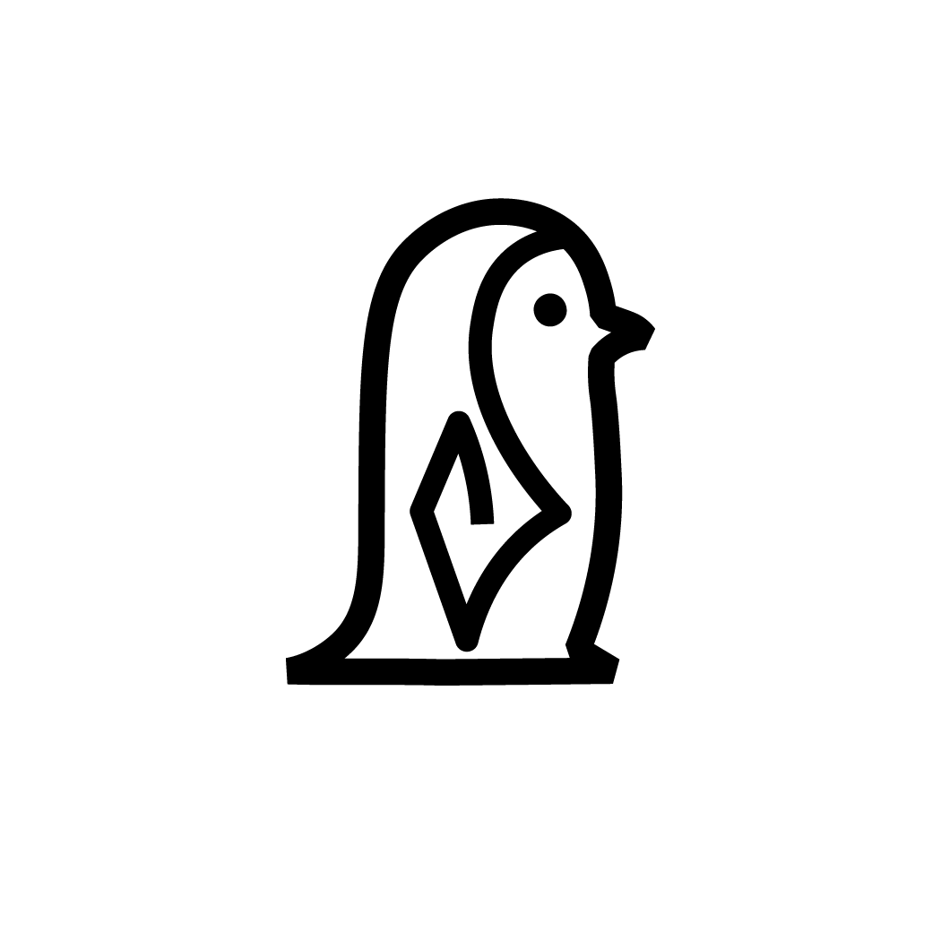
Archie the Penguin B&W
Archie the Penguin Logomark
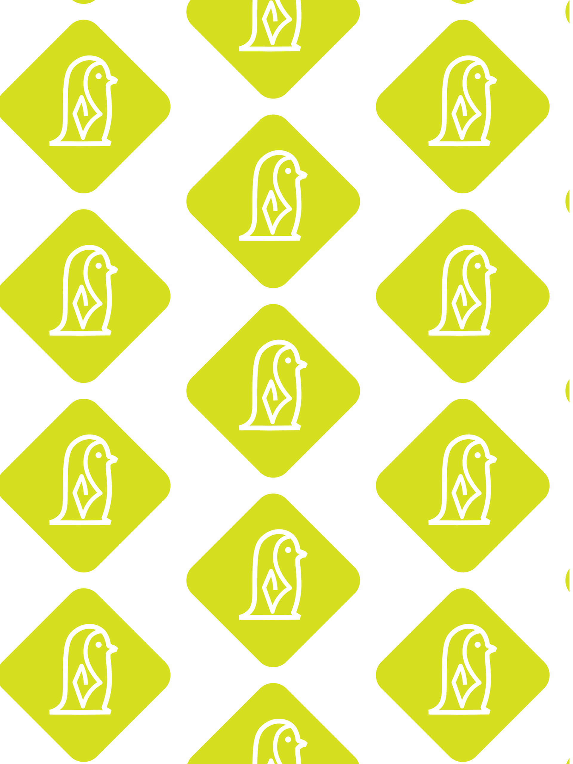
Brand pattern 1
