The product:
Cookery is a new online product aimed to help young adults choose and create healthier cooking and eating habits.
The goal:
Design both an app and responsive website that will educate and provide healthier food resources to young adults.
Responsibilities:
Conducting interviews, wire-framing, low and high-fidelity prototyping, conducting usability studies, accounting for accessibility, iterating designs, determining information architecture, and responsive design.
Software Used:
Adobe XD, Figma, Adobe Photoshop
________________________________________________________________________________
Understanding the User
After some initial research into Cookery’s target audience, I developed interview questions to address some of the negative stereotypes around healthier cooking. During the user interviews, most participants admitted that although they want to cook healthier, they choose unhealthy alternatives because they don’t have much education on how to incorporate better cooking habits in their lives, and they don’t really know where to start learning. This feedback showed me that users would be willing better cooking habits if there is a product or service that was available to guide them.
Personas & Problem Statements
In order to understand the user‘s experience, I created two personas based on the user research.
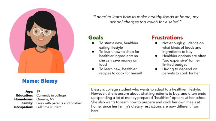
Persona 1: Blessy
Problem statement: Blessy is a young college student who needs to be able to choose and prepare healthier food options because she wants to start adopting a healthier diet and lifestyle.
Starting the Designs
Low-fidelity Prototype
To prepare for the usability test, I created a low fidelity prototype that connected the user flow of searching for an ingredient or recipe and saving it for later.

Low fidelity prototype created with Figma.
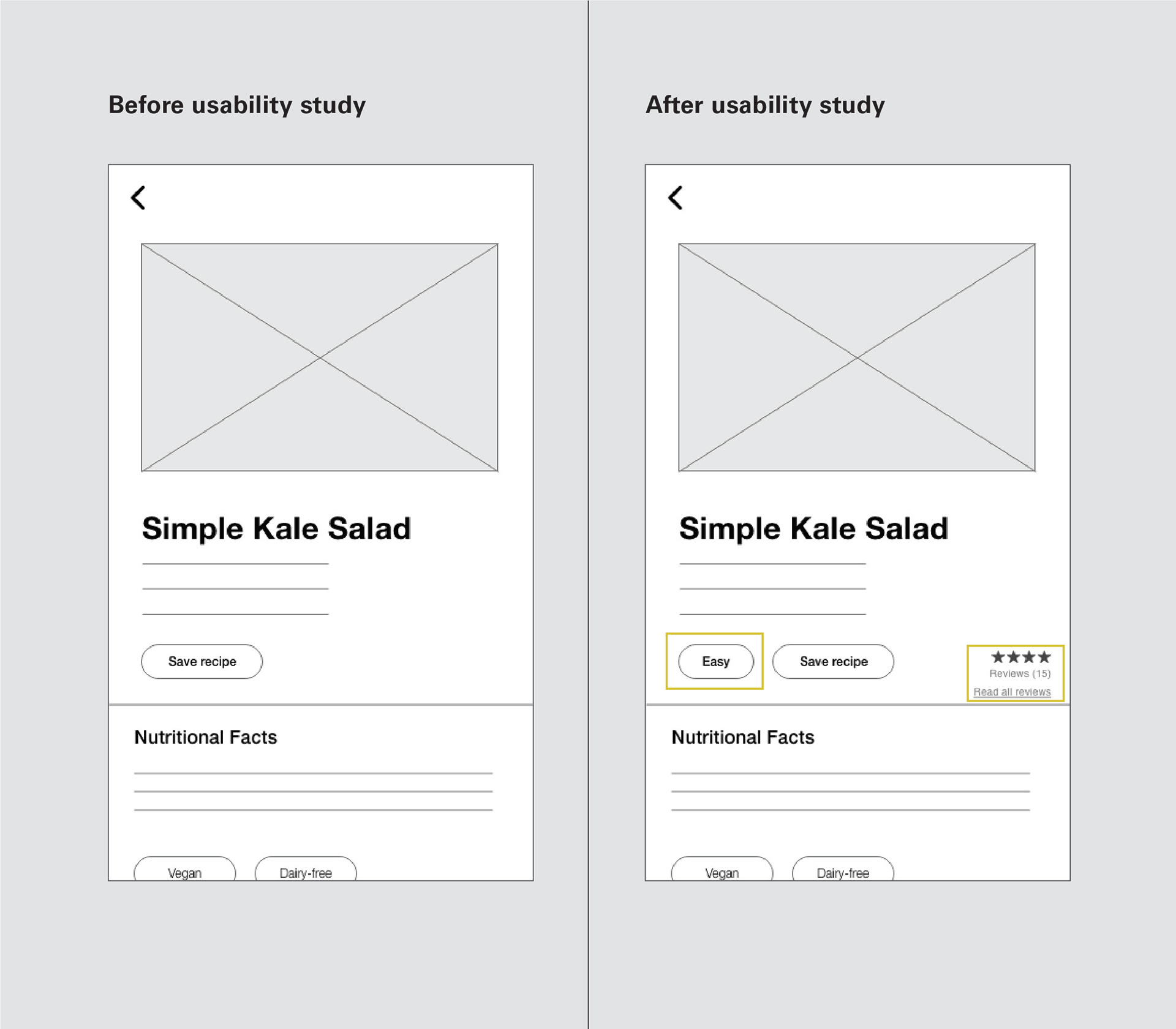
Mockup Changes
Design changes were added based on the usability study. For example, on the recipe page, additional nutritional facts were added, as well as a difficulty label and rating system, as well as a link to user reviews.
High Fidelity Prototype

High fidelity prototype created with Adobe XD.
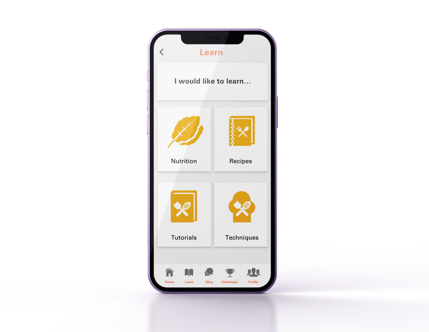
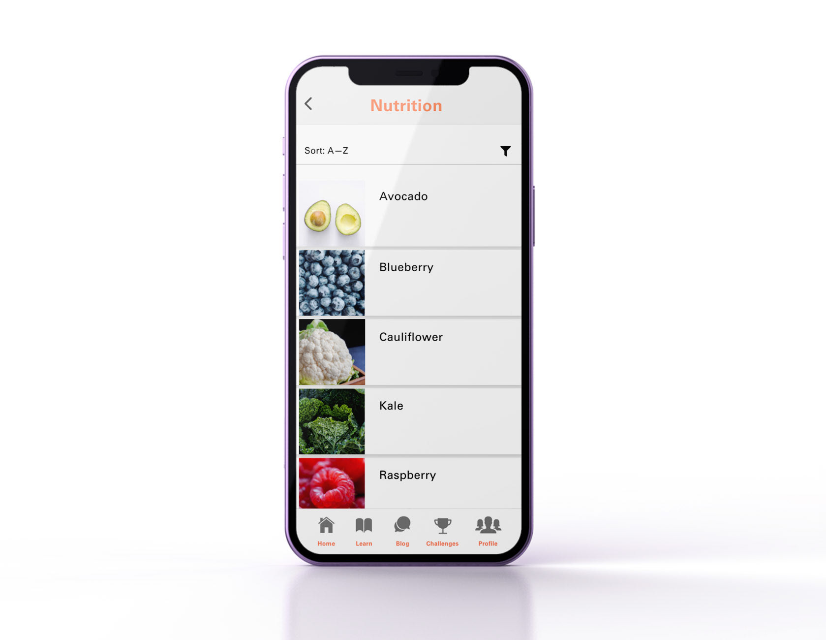
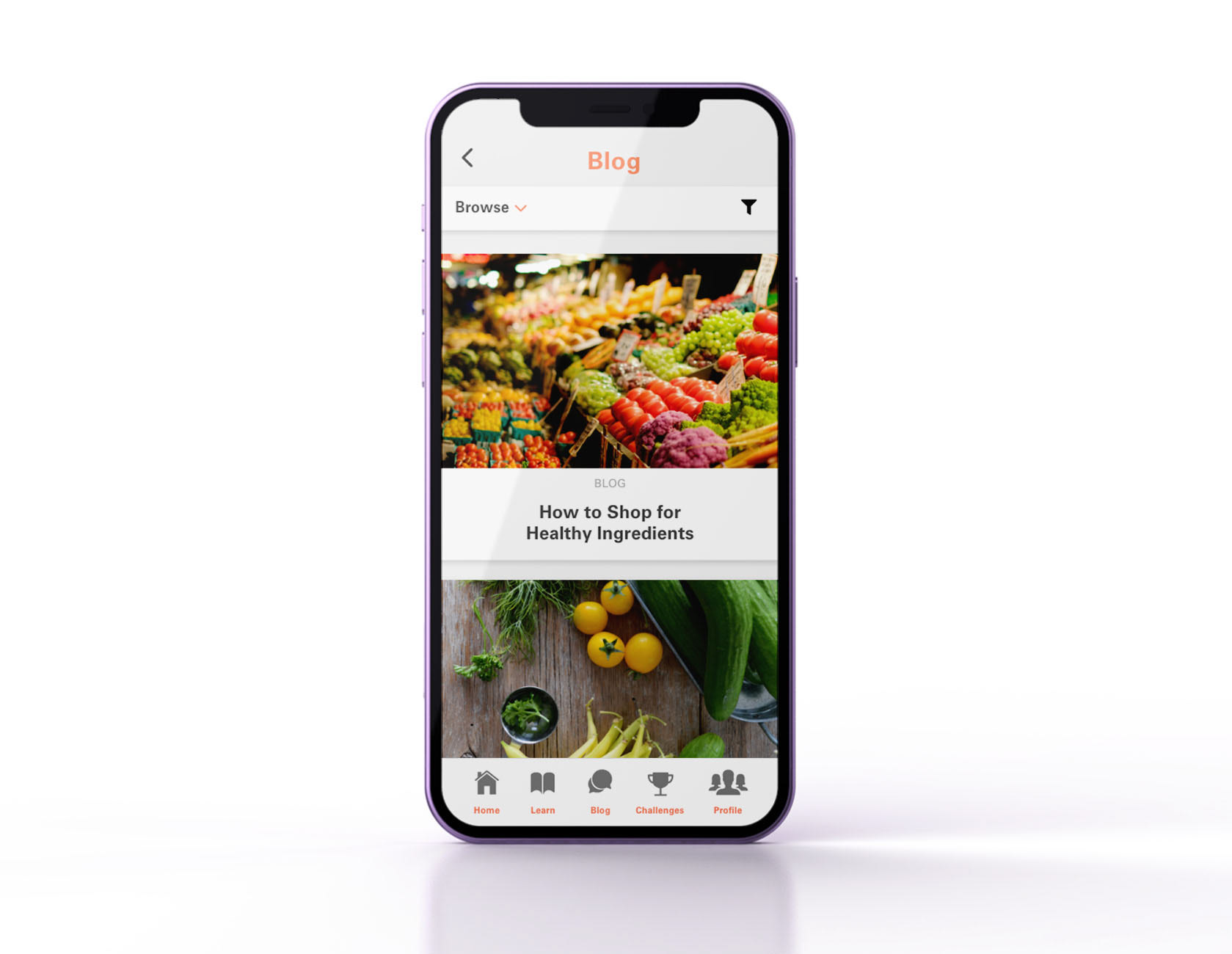
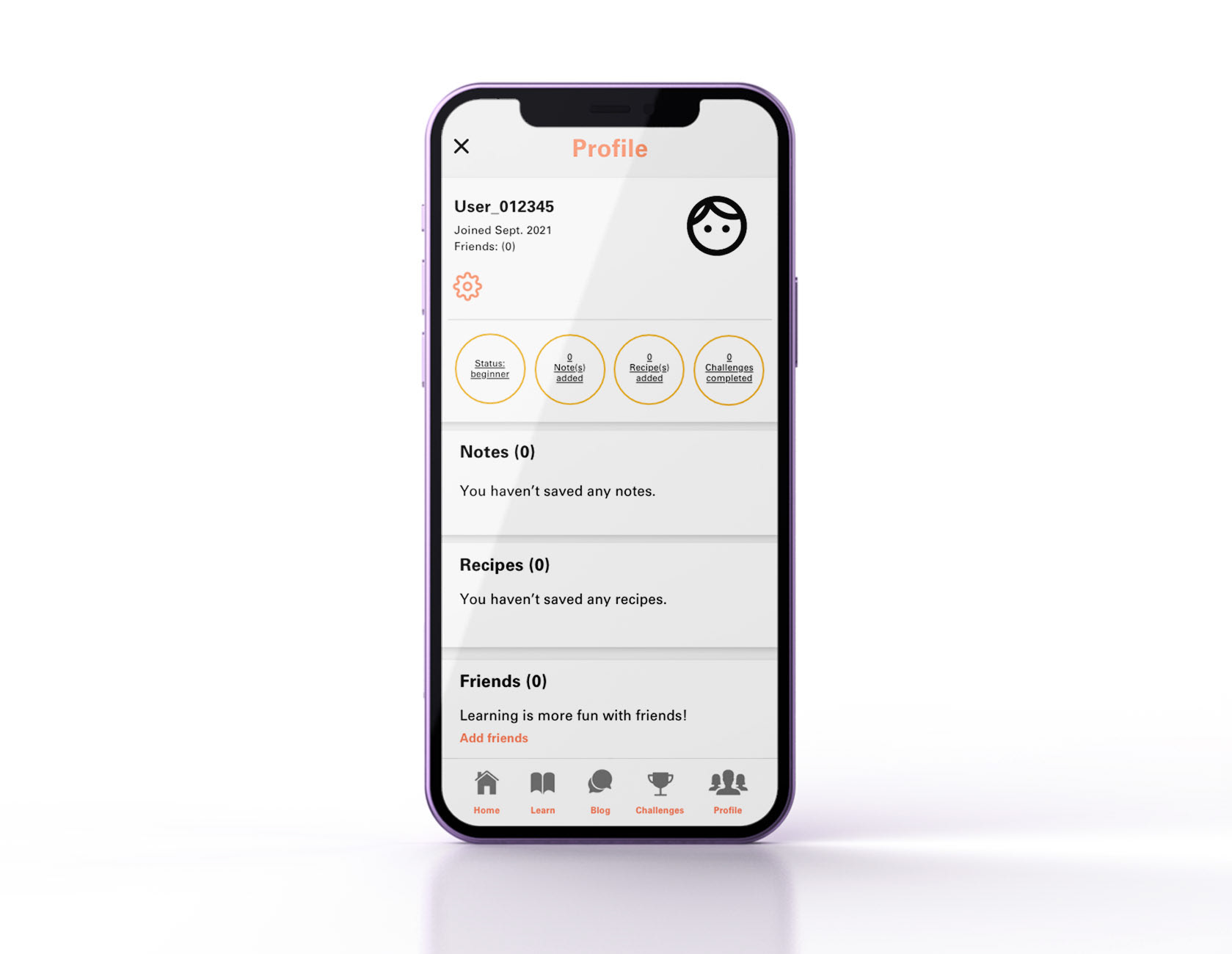
Mobile App Designs




Responsive Designs
Mobile Devices:
The mobile design features a single column layout with a hamburger menu in the top-left corner. There are also quick links underneath the logo for users to quickly access specific information.
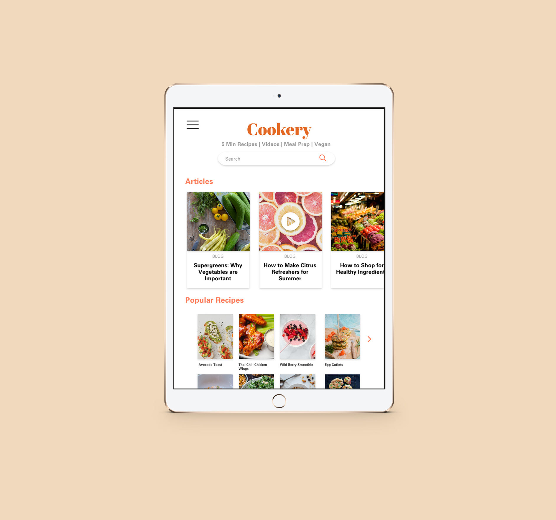
Tablet:
I chose to design this layout based in an iPad Pro (10.5 in). With the extra space, I added more content to the home page, and moved the search bar underneath the main logo.
Desktop:
Since the desktop has the biggest screen, I decided to optimize the space by adding more content while keeping enough white spacing to keep the different groups of content separate and easy to navigate. I also simplified the navigation bar, and added a log-in / sign up button to the top right corner.
Key Mockups

Mobile view
Tablet view 1

Tablet view 2

Desktop view 1

Desktop view 2
Takeaways & Next Steps
Impact:
Users shared the product was something that they genuinely interested in using. One user described it as “approachable” and “less cluttered looking” than other products and websites.
What I learned:
Although there is interest in the initial product, the biggest challenge will be user retention, since there are many alternatives that people are more familiar with to find similar information.
Next Steps:
1. Conduct additional research to see user retention over the next couple of months.
2. Add more education resources based on user feedback through periodic updates.
3. Increase product awareness by marketing to new users through social media platforms popular with target audience.