Project Overview
The product:
Wick’s Florist, Fruitera & Greenhouse are a family owned local florist shop that is committed to offering only the finest floral arrangements and gifts, backed by service that is friendly and prompt. They are in need of an updated responsive website to better serve their customers, especially during the pandemic.
The problem:
Due to the pandemic, more people are relying on the internet to place orders, however, Wick’s current website is outdated, and is hard to navigate, which has driven potential customers to shop at competitors with more up-to-date ordering processes.
The goal:
Design a responsive website with an updated online ordering flow that is user friendly, features clear navigation, and offers a fast checkout process.
My role:
UX designer designing a responsive website, from conception to delivery.
Responsibilities:
Conducting interviews, paper and digital wire-framing, low and high-fidelity prototyping, conducting usability studies, accounting for accessibility, and iterating on designs.
Project duration:
August 2021
Understanding the User
I conducted user interviews, which I then turned into empathy maps to better understand the target user and their needs. I discovered that many target users would rather place orders online than travel into the store, which only has one location. However, the current website is overwhelming and confusing to navigate, which has led to some frustration among users who want the process to be as easy as possible.
Persona & Problem Statement
In order to understand the user‘s experience, I created a persona based on the user research.
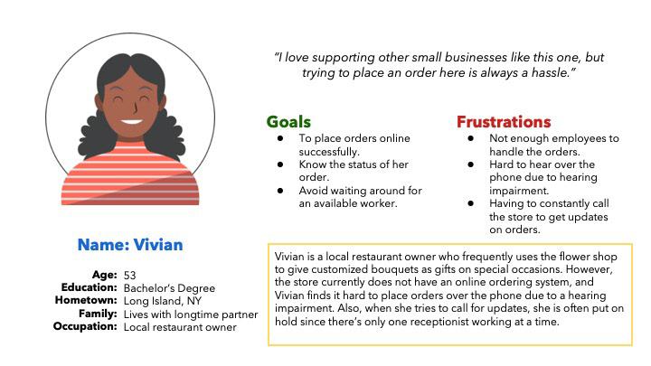
Persona 1: Vivian
Problem statement: Vivian is a local business owner and supporter who needs to be able to place orders online on her own because it is hard for her to place orders over the phone due to a hearing impairment.
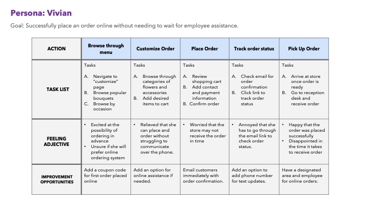
User journey map
Journey map:
After I finished creating a persona, I created the journey map of Vivian’s experience using the site to help identify possible pain points and improvement opportunities.
User Pain Points
These were the top three pain points identified within the primary user group.
1. CompositionCurrent website layout is busy and cluttered, which results in confusing navigation
2. Responsiveness
Current website does not feature a responsive layout that is optimized on smaller screens than a desktop
3. Experience
Shopping on the website does not provide an engaging browsing experience due to outdated features and design choices.
Starting the Design
Original Website Design
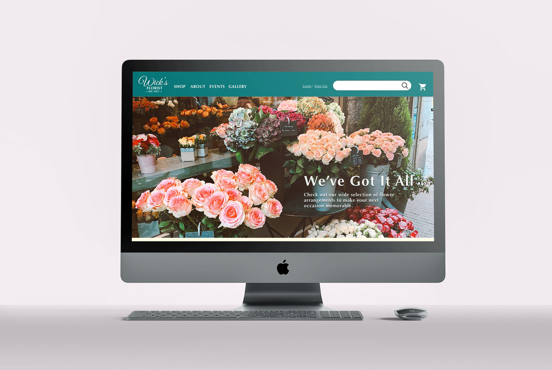
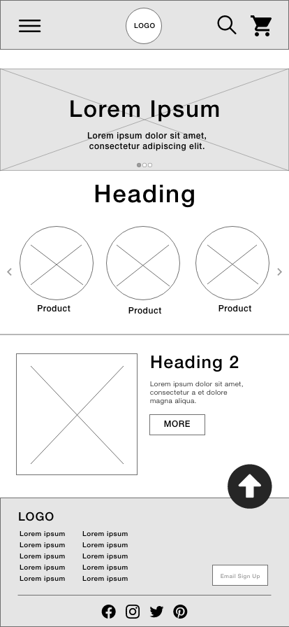
My first step was to review the original website, so that I could get a better idea of the user's pain points and what solutions I could use to address them. There were definitely some design elements that needed to be addressed and updated, however, I found that the the main user flow of placing an order was not too complicated or difficult to complete.
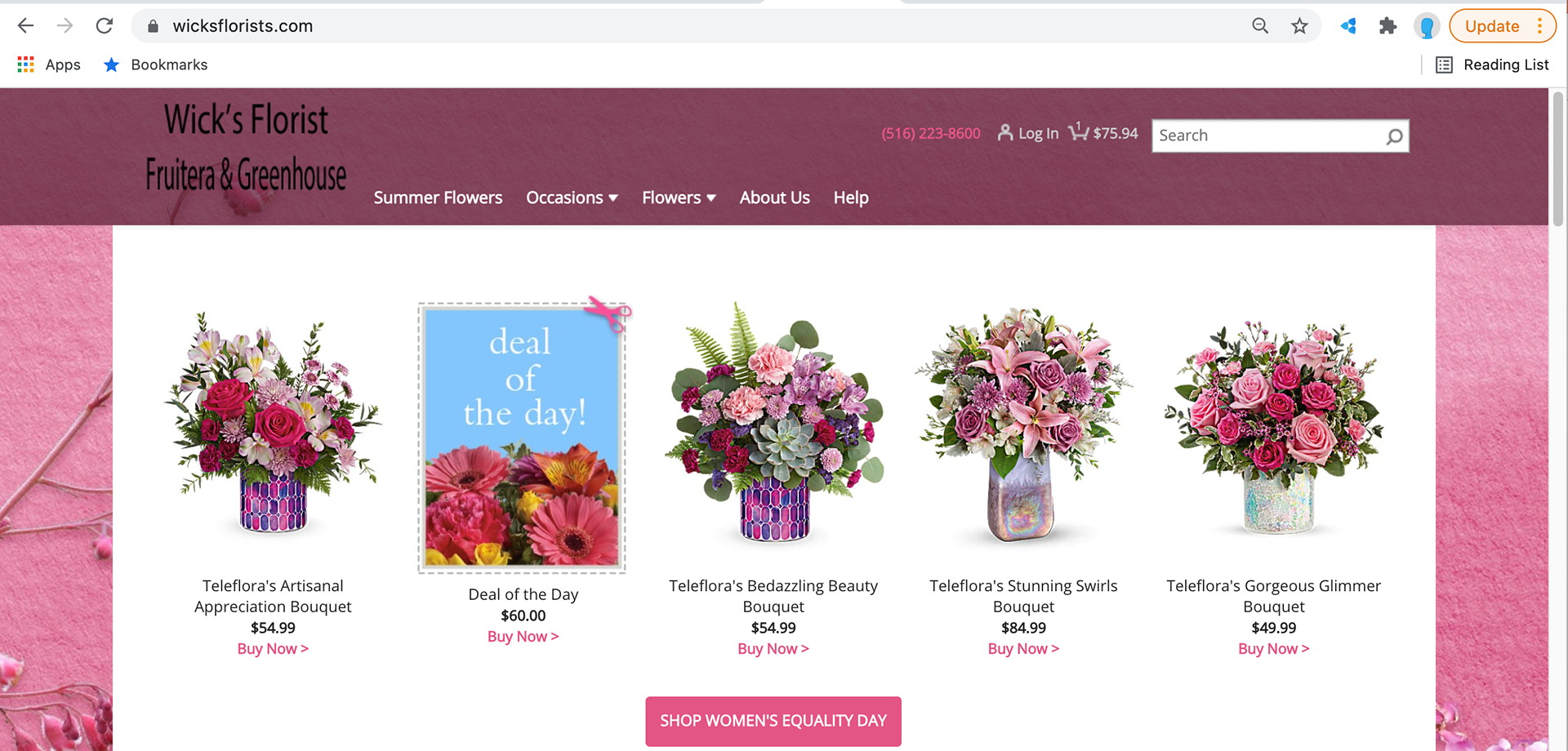
Screenshot of the current website.
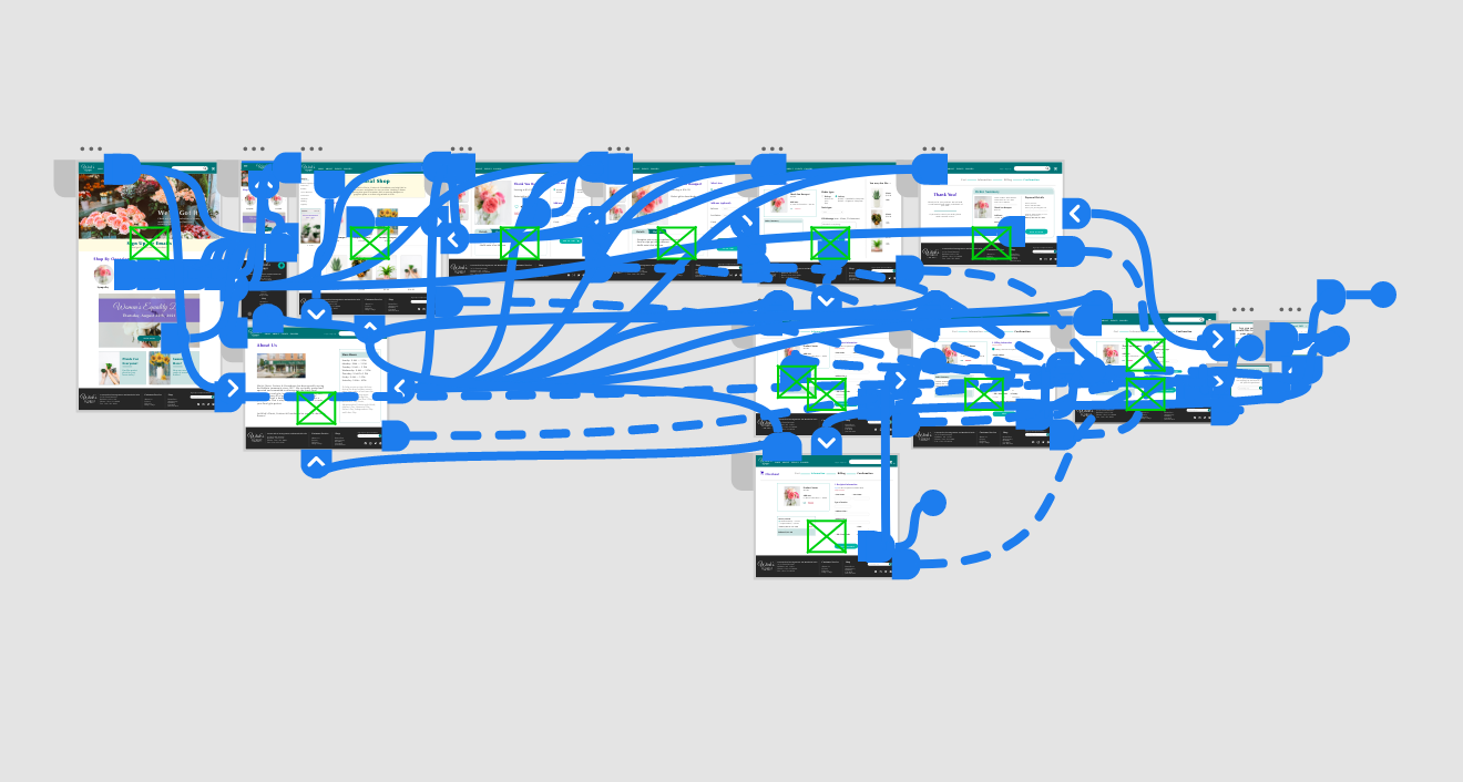
Informational Architecture (Sitemap)
Using information from the original site, I began creating a sitemap to guide the organizational structure of each screen’s design to ensure consistency across both devices.
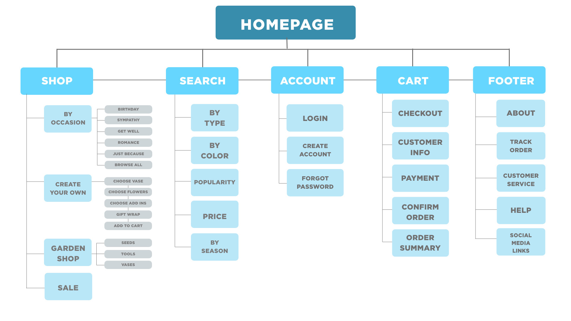
Sitemap of desktop version.
Paper Wireframes
After creating the sitemap, I then started drafting paper wireframes for the homepage of the desktop site. Once I had a basic idea of what i wanted to include on the home page, I looked at what elements were the most important to include on the mobile version, since the mobile version has a much smaller screen size.
Digital Wireframes
Once I was done with the paper wireframes, it was easy to move into the digital wireframes. I made sure to constantly reference the original site to make sure that I include necessary elements, such as a search bar, and improvements, such as an organized page layout based on Gestalt Principles, to address user pain points and improve their overall experience.
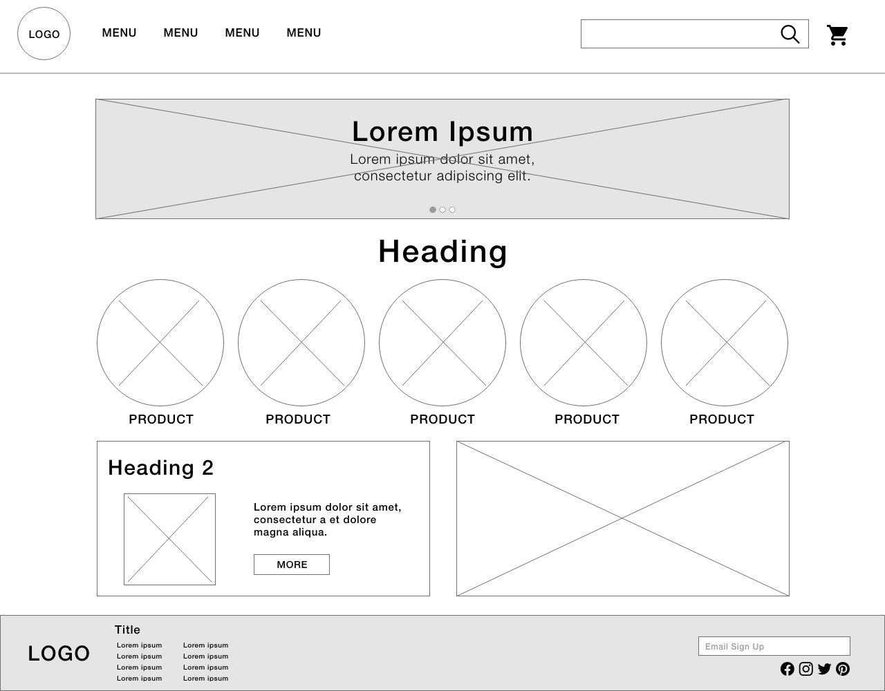
Wireframe for desktop version.
Wireframe for mobile version.
Low-fidelity Prototype
Once finished creating several pages needed for the main user flow, I connected all of the screens to create a low-fidelity prototype. The primary user flow includes browsing for a product, adding an item to the cart, successfully checking out, and being able to review the order information.
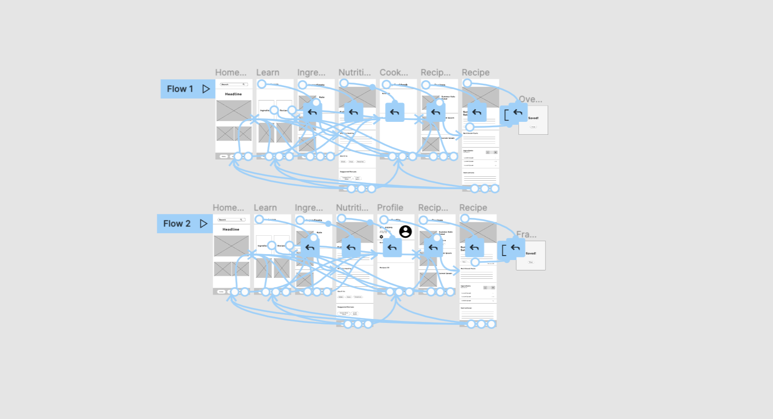
Low fidelity prototype created with Figma.
Usability Study Results
I tested the low-fidelity prototype in an unmoderated usability study with 8 participants. Here are the main findings:
1. Cart:
Once at the checkout screen, users didn’t have a way to edit the items in the cart or remove them.
2. Checkout:
Users weren’t able add any information or select delivery preferences.
3. Account:
During the checkout process, there wasn’t a clear way for users to log in to their account to pre-fill previous billing and shipping info.
Mockup Changes
Based on the insights from the usability study, I made changes to improve the website’s checkout flow. One of the biggest changes I made was adding a small box to the bottom that has a mini-review of the order that will update as the customer progresses through the checkout process. I also added more details and options to the checkout process, such as the ability to add any notes, edit the cart, and add a gift message.

Before usability study
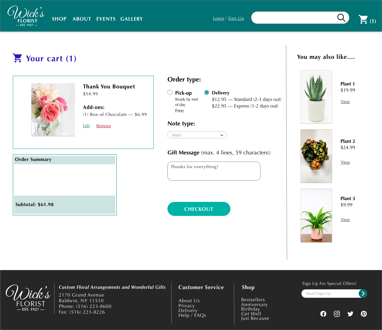
After usability study
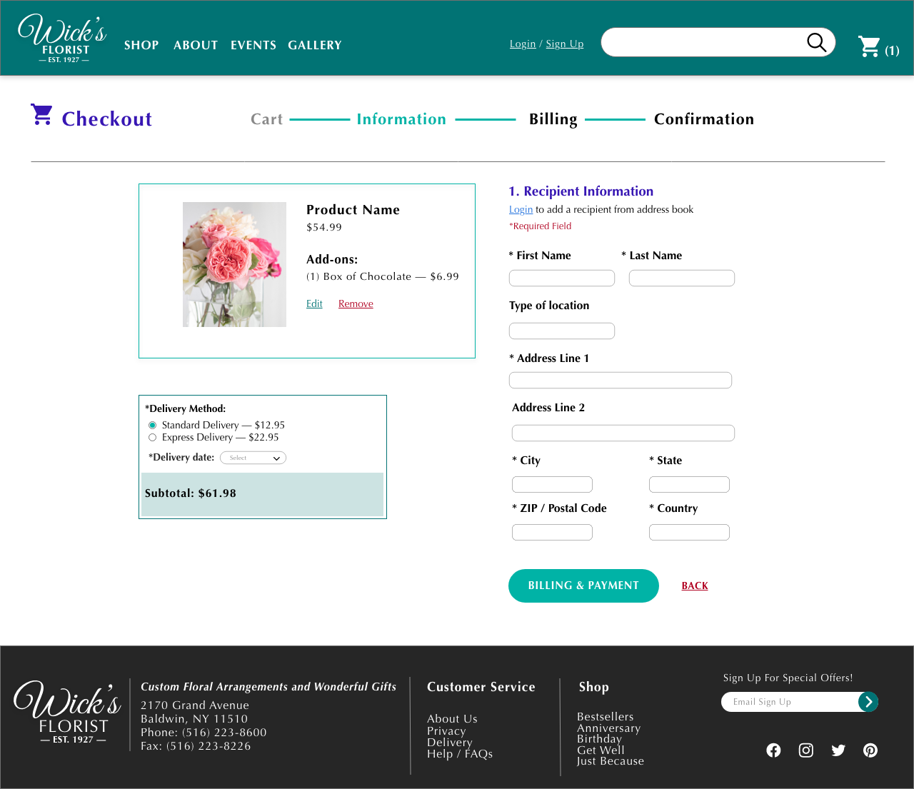
To address user’s concern about being able to fill out their information, I designed an extensive checkout screen that allows users to add their billing and shipping information. This information is then available to be reviewed on the confirmation screen.
High Fidelity Prototype
The high-fidelity prototype follows the same user flow as the low-fidelity prototype, including design changes based on the usability study.
High fidelity prototype created with Adobe XD.
Responsive Designs
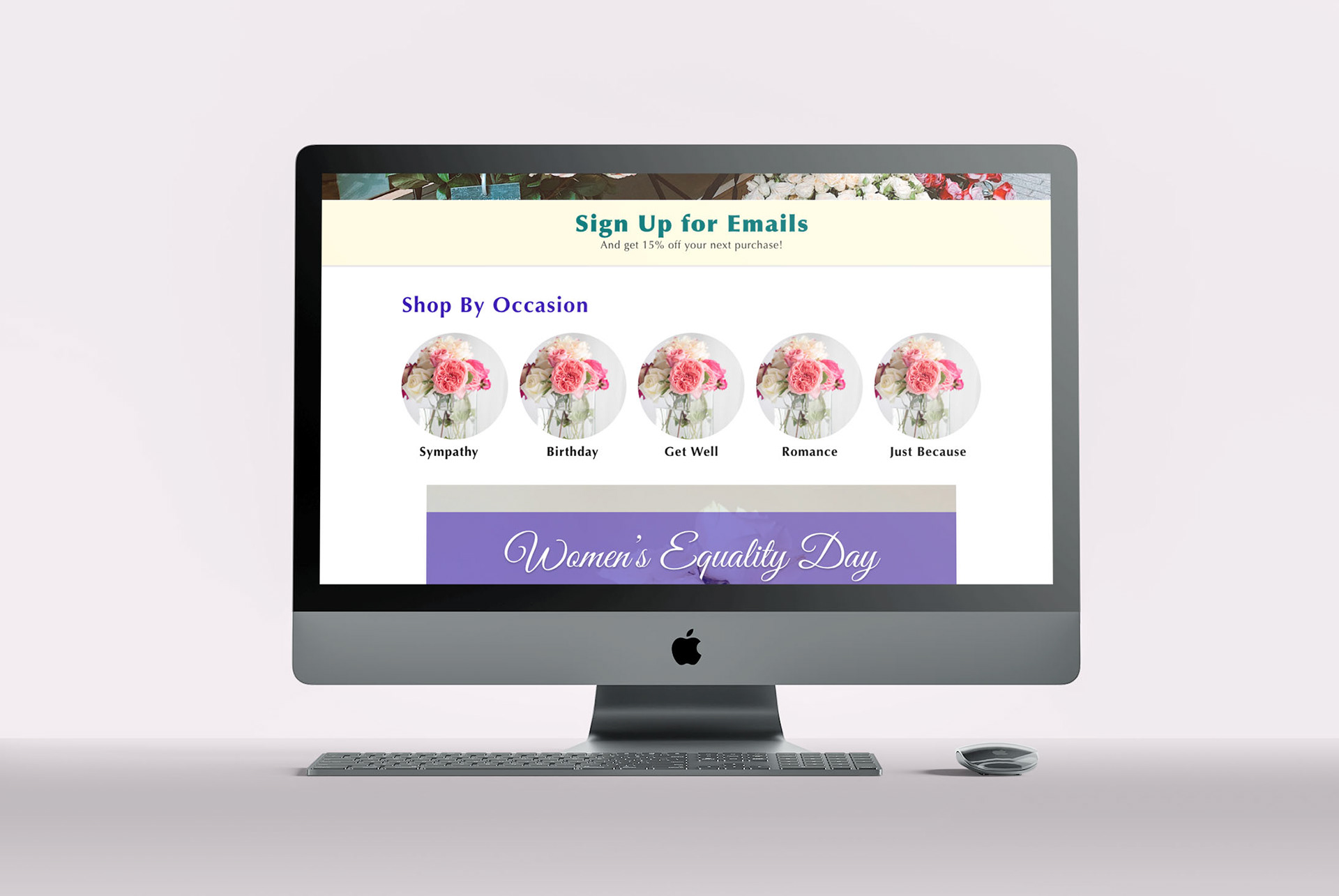
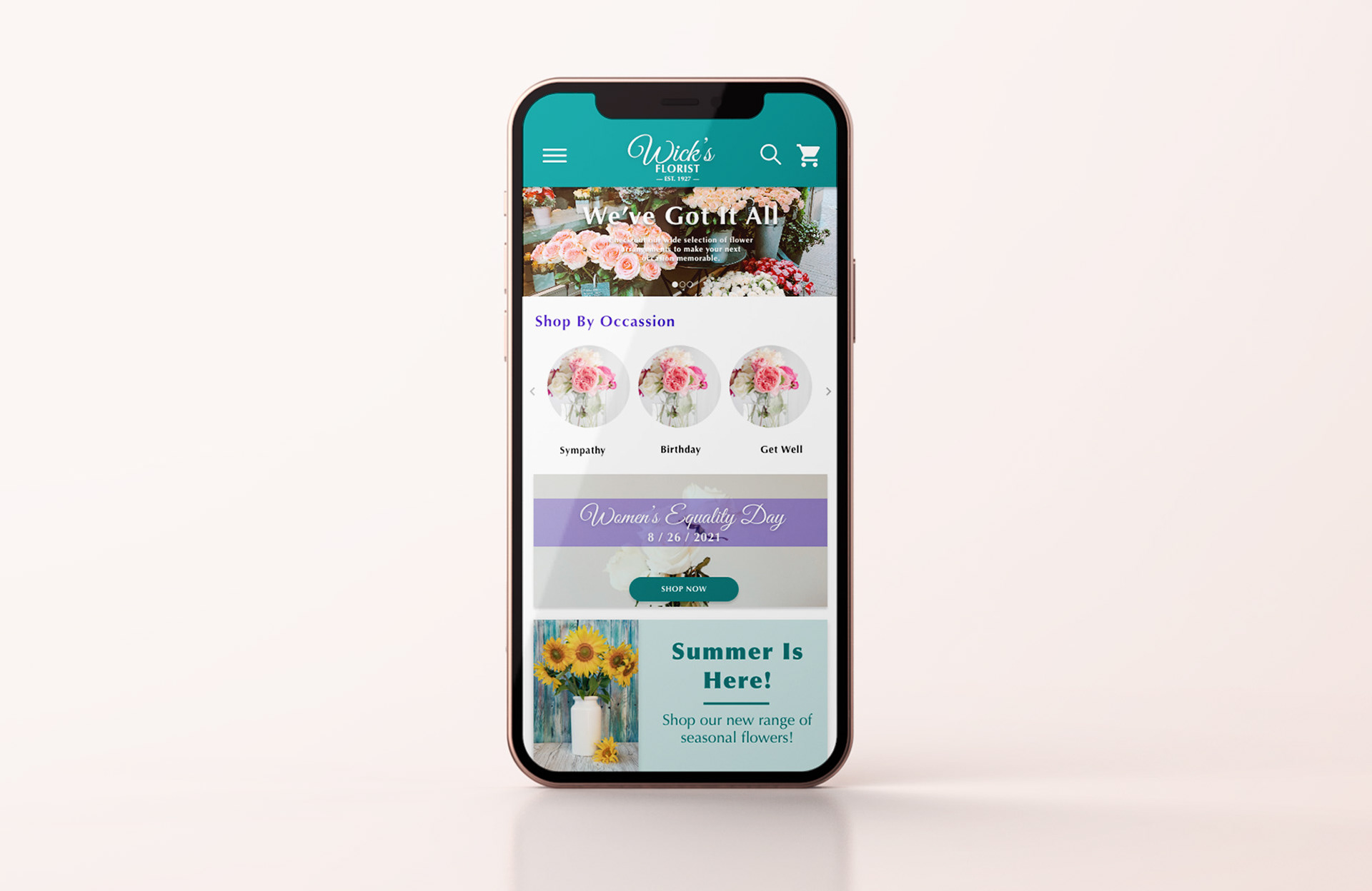
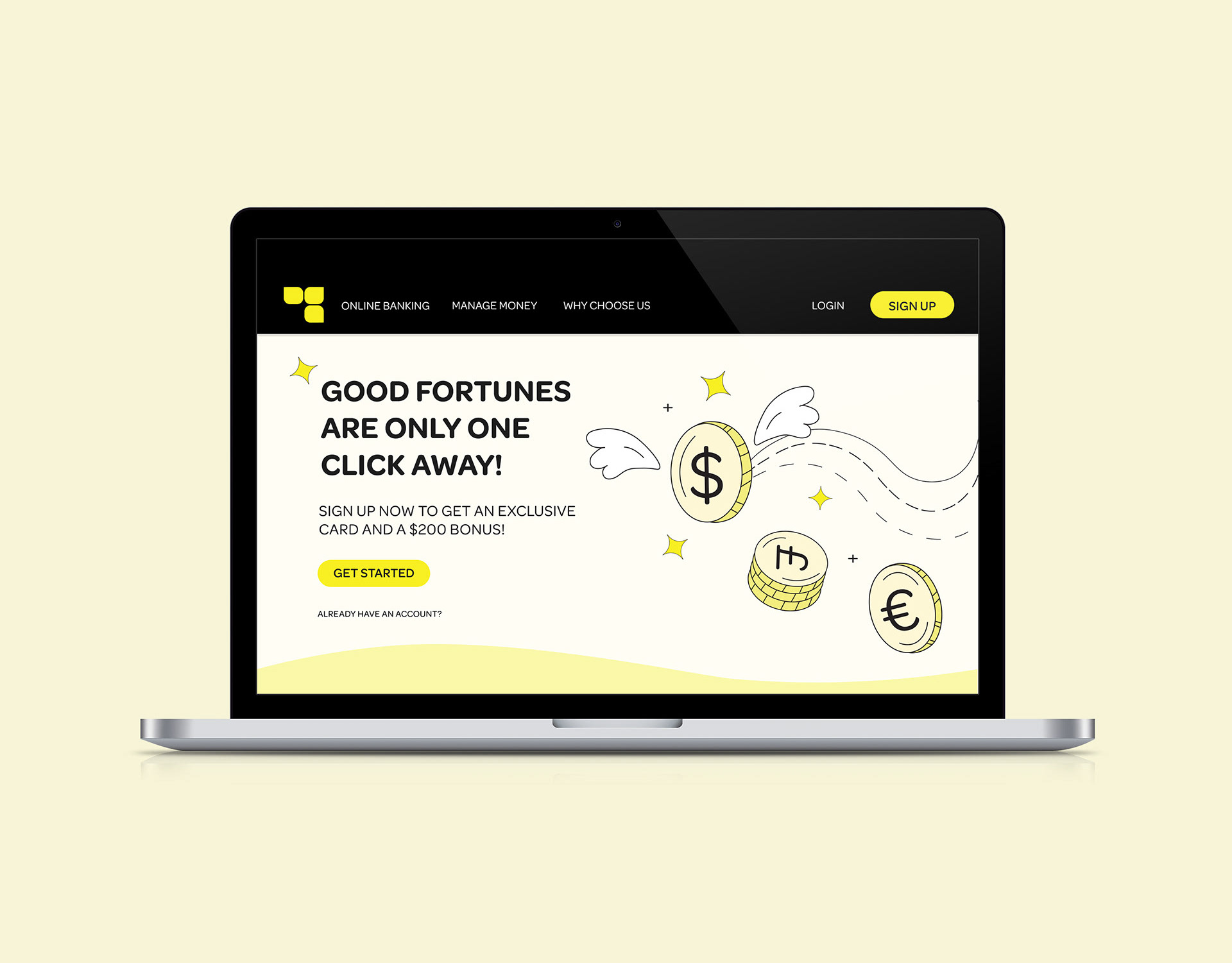
View of home page.
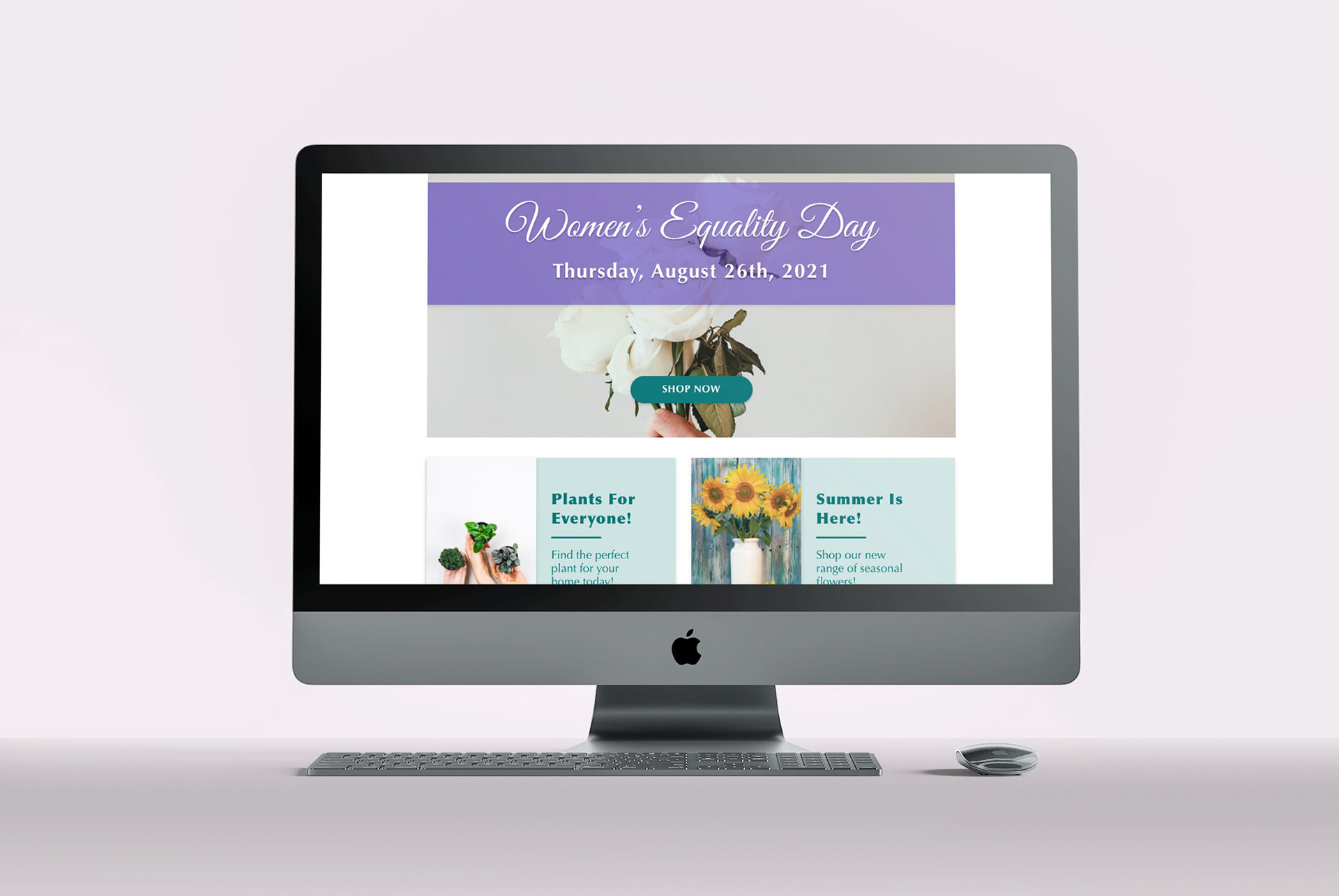
Scroll view of home page.
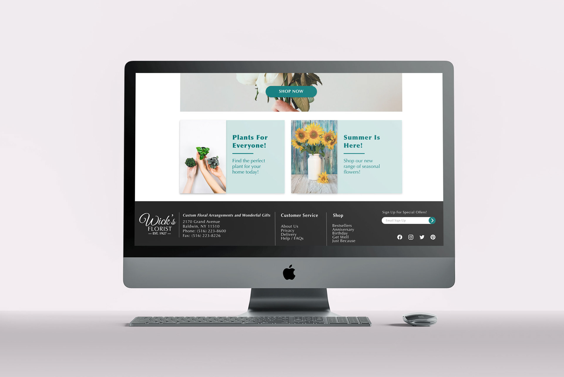
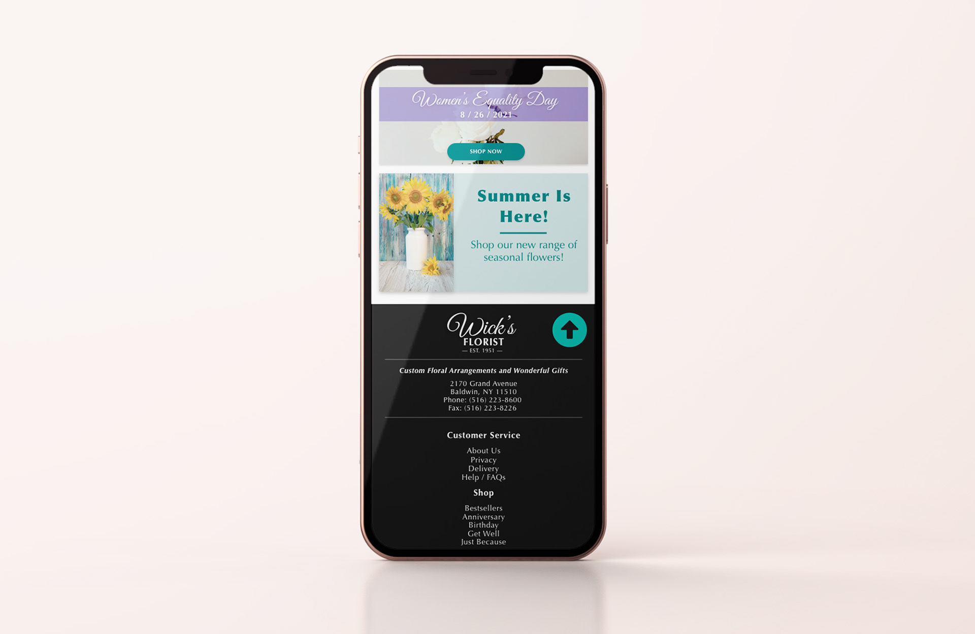
Bottom view of home page.
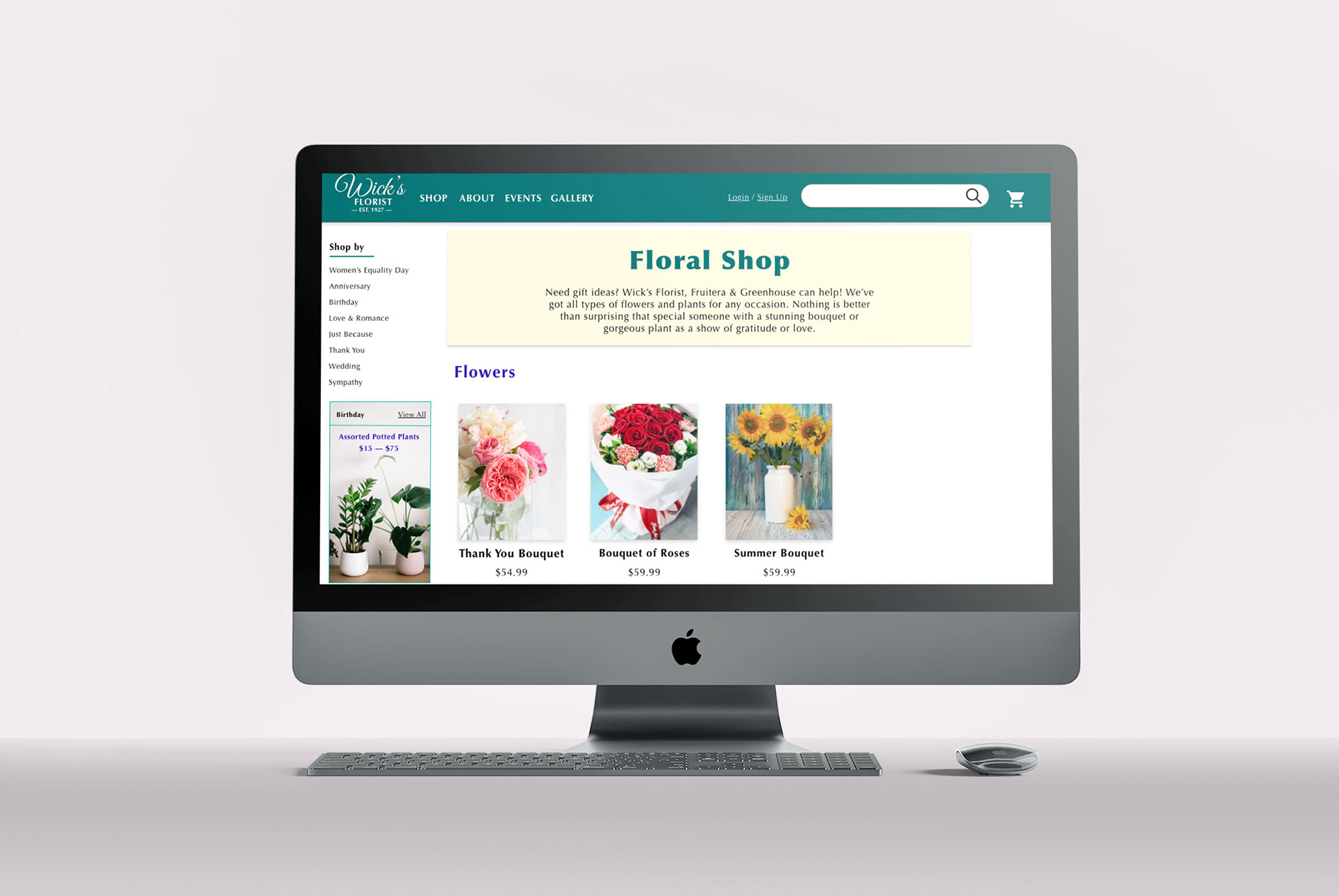
Products listing page.
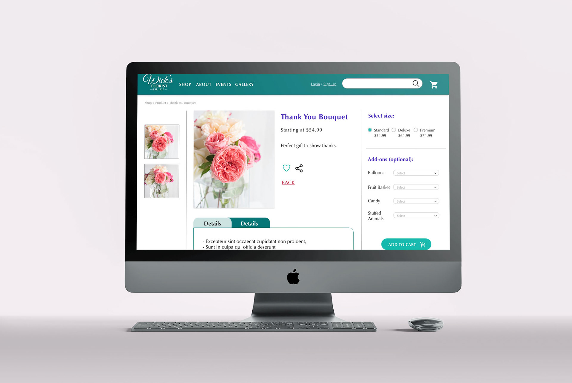
Product page.
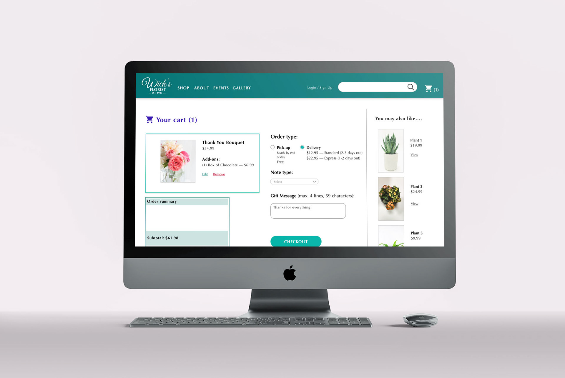
Checkout page.
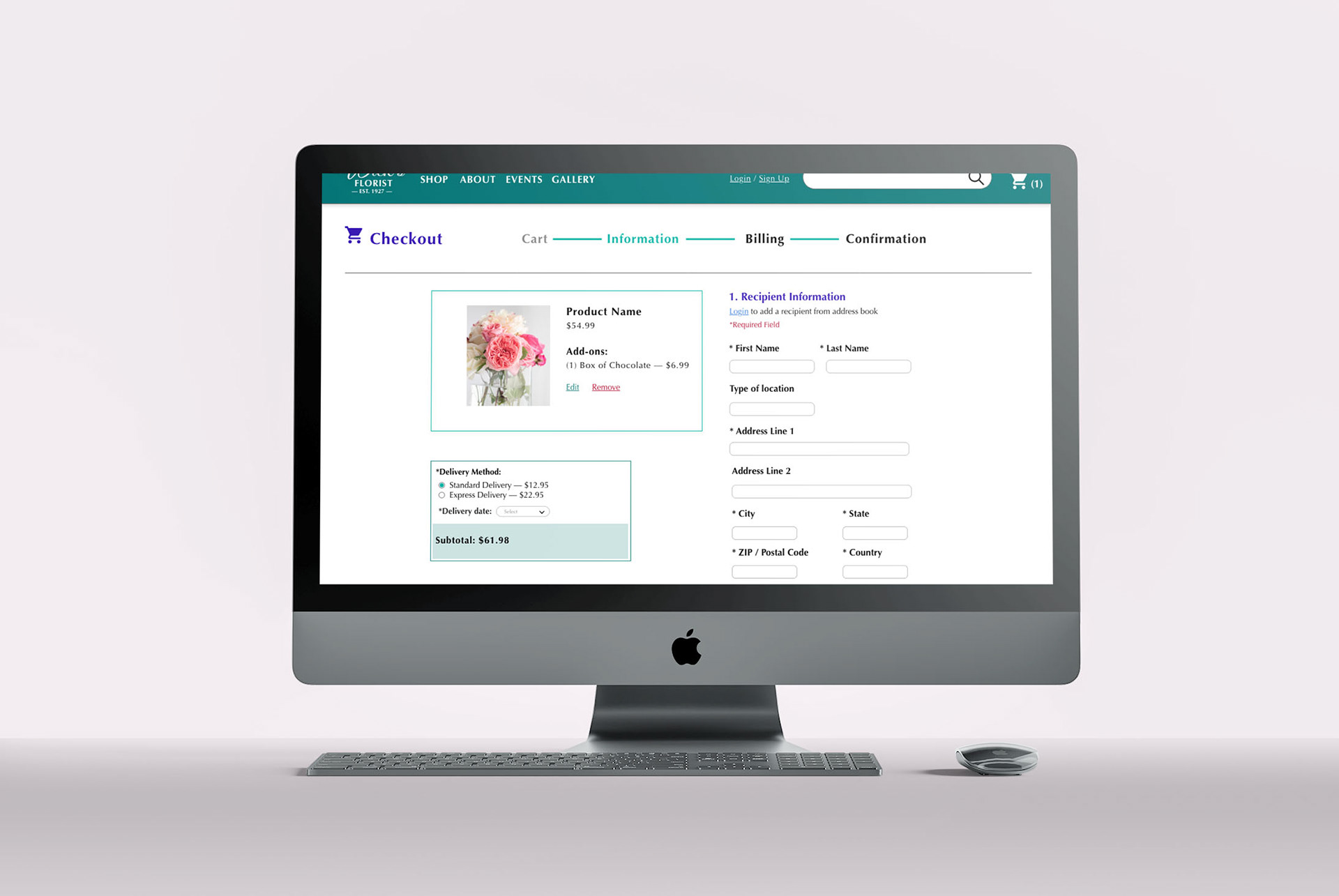
Customer information page.
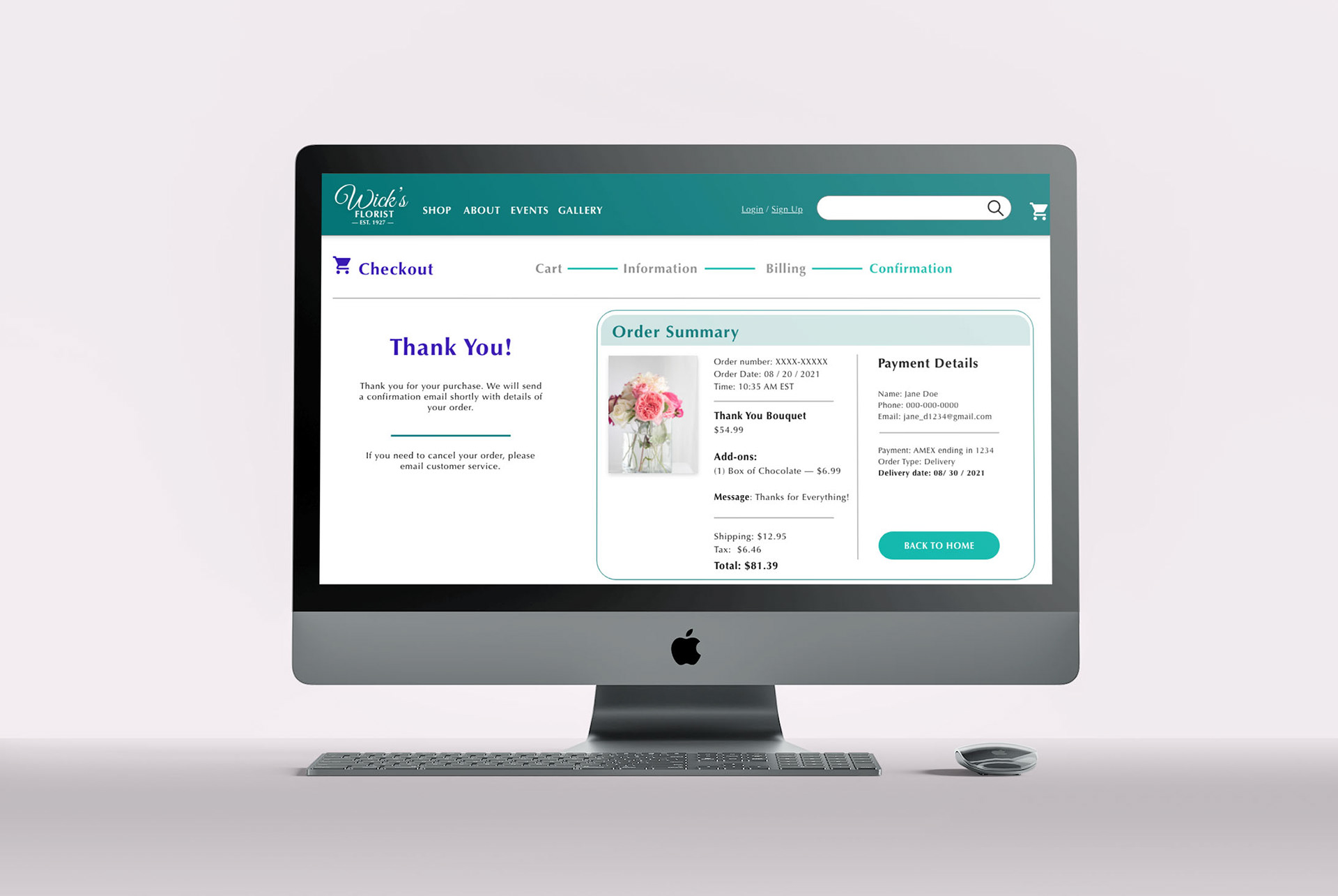
Order summary page.
Mobile view 1.
Mobile view 2.
Accessibility Considerations
1. Provided access to users who are vision impaired through adding alt text to images for screen readers.
2. Used landmarks to help users navigate the website, including those who use assistive technologies.
3. Used various heading sizes to create visual hierarchy to help users navigate the website and organize content.
Takeaways & Next Steps
Impact:
The updated website was more engaging and easier for users to complete the main user flow, and less frustrating to navigate.
What I learned:
Although there were many new features that I wanted to incorporate, it was important to remember to focus on user needs first, and make sure that the updated designs were equitable and addressed the user's pain points.
Next Steps:
1. Conduct further research by sending voluntary surveys for customers to comment on their recent shopping experience.
2. Identify any additional areas of need and ideate on possible solutions.